Wedding Portrait - Commission (wip)
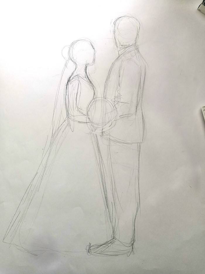
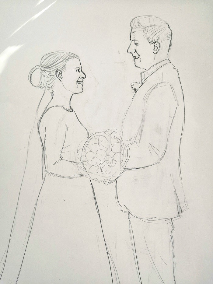
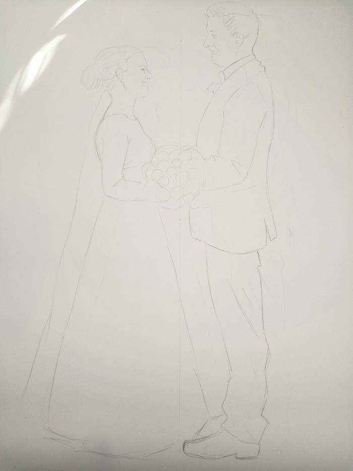
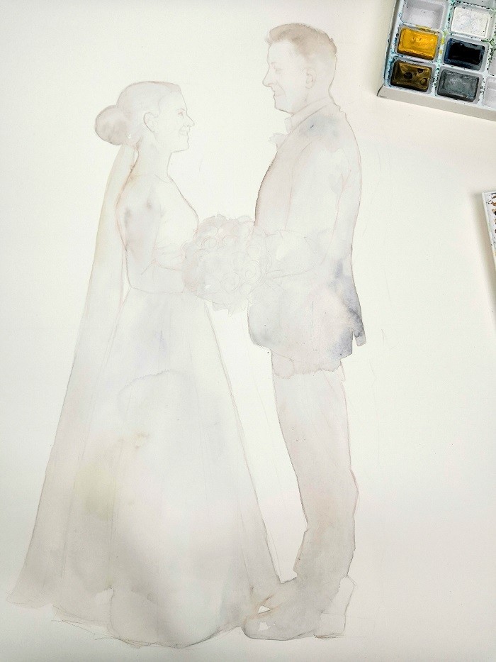
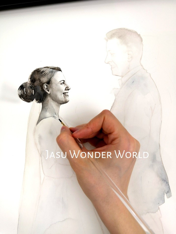
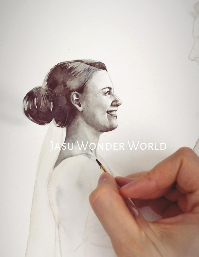
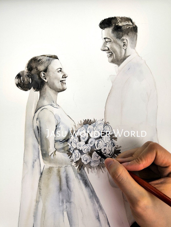
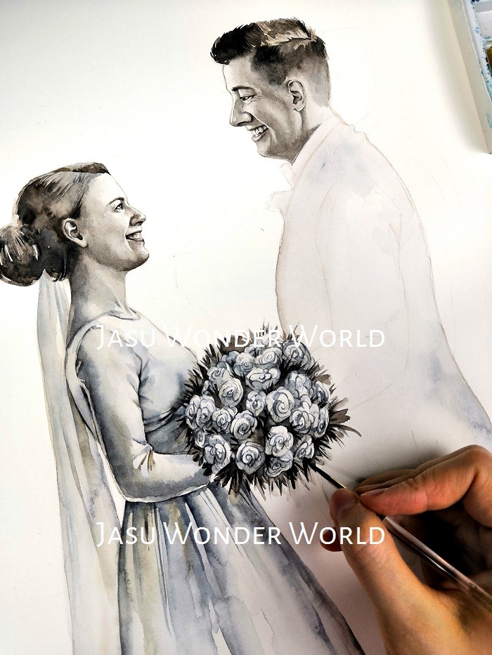
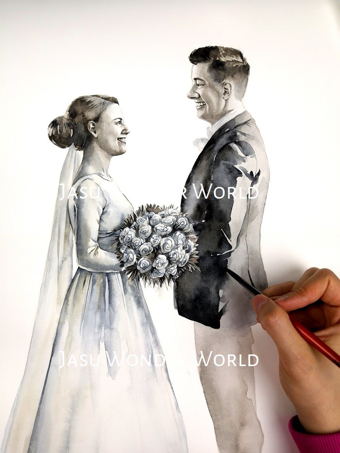
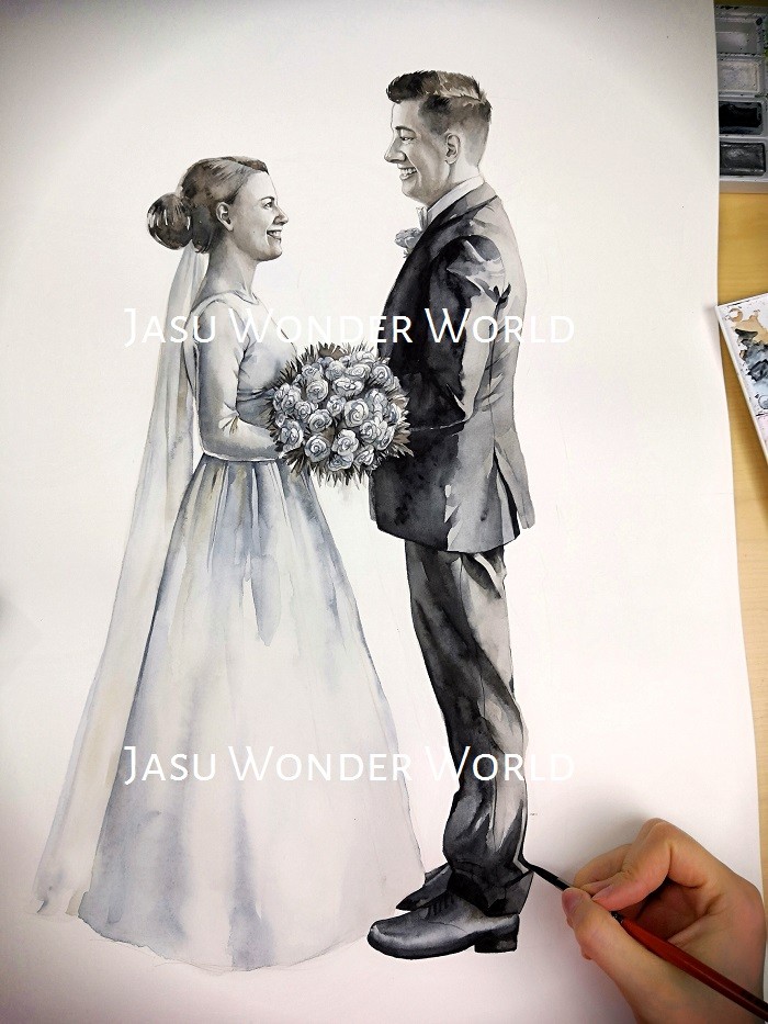
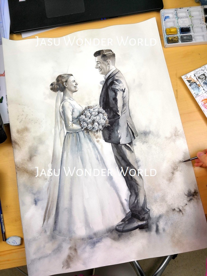
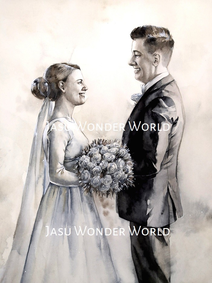
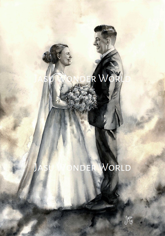
This painting took me surprisingly little time considering it was A2-sized. But then again, the commissioner wished the painting to remain rather simple and wanted the surroundings of the couple to be blurry. So, at the end, the only places where I really needed to pay attention were the faces of the two people, and their upper bodies. As can be seen, the commissioner also wanted me to use a restricted color palette: gray, black, brown and beige. All in all, I feel this was a very different kind of an artwork compared to everything I usually create and now that it is finished, I somehow need to assure myself that it was me who painted it.
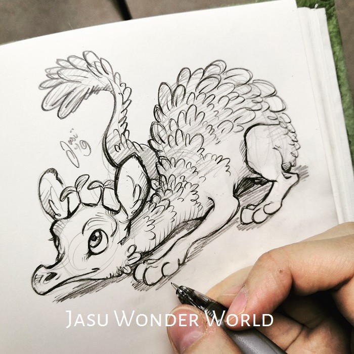
Also, the little dragon doodle between all the wip pictures was a result of a little break I took from all the watercoloring to refresh my brain. Thought I'd share it on this post as well since, in a way, it was part of the process.
When you subscribe to the blog, we will send you an e-mail when there are new updates on the site so you wouldn't miss them.
By accepting you will be accessing a service provided by a third-party external to https://jasuwonderworld.com/


Comments